Your Intranet Theme
Articles
What is a Theme?
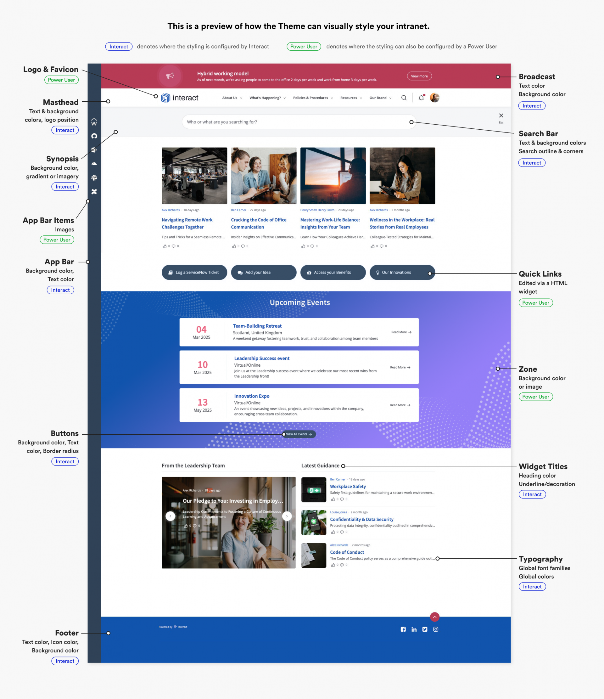
You can think of the ‘Theme’ as the top layer or ‘skin’ of your Intranet, which controls the visual style of the interface and your content – such as the colours, fonts, logo, and (in some instances) imagery. It does not control the functionality of your intranet, or the organisation of your homepage. The Theme is what makes your intranet look and feel as if it truly is your own. Below, you can see a breakdown of some specific elements which can be styled by the Theme:
Font/Typeface
We can set the font families which are used on your intranet. This could be just one typeface for all text, or two – one for the body copy and another for titles/headings. We can configure a web-safe font (ie. Arial), a free-to-use font (ie. Roboto), or a licensed/purchased font (ie. Neue Haas Grotesk, or perhaps your own custom-made brand typeface). We’ll discuss this with you, and below you’ll find a breakdown of the different approaches that could be taken.
Web-safe Fonts
“Web Safe” means that a font is likely to be present on a wide range of computer systems, and therefore can be viewed by almost everyone. The most popular and universally accepted web-safe fonts include: Arial, Verdana, Tahoma and Georgia. Learn more about Safe Web fonts. If you’d like to use a web-safe font on your intranet, just let us know which one.
Free-to-use fonts (ie. Google Fonts)
You may choose to use a free font family. A commonly used library of free-to-use fonts is Google Fonts. These fonts are ‘open source’ which means they are free to download and use wherever you wish, in both personal and commercial scenarios. If you’d like to use a Google Font, just let us know the name of the font and we can do the rest. If you’d like to use another free-to-use font, please let us know the details in our discussions.
Licensed fonts (ie. files, or Adobe Fonts)
You may have a licensed font, which you have purchased in order to use as part of your brand identity, or perhaps you have a custom-designed brand typeface. If you have the web license for your font, you will be in possession of the web font files – these are file formats which end in .WOFF, .SVG, .EOT or perhaps .OTF. We will ask you to share these files with us, so they can be hosted on your intranet.
You may use Adobe Fonts (formerly called Typekit) to host your licensed fonts. If this is the case, we’ll ask you to share the embed code for your chosen font families. The default embed code should look something like this: https://use.typekit.net/xxxxxxx.css. For more information on this, see this page from Adobe: https://helpx.adobe.com/uk/fonts/using/embed-codes.html
Please note: Any font you share with us must be licensed to permit web use. It is your responsibility to ensure that you have a web license for any custom font you choose to have uploaded to your intranet. Interact does not purchase fonts on behalf of clients.
Top tip: Keep legibility in mind! The body copy on your intranet, in particular, may not be particularly legible if a typeface is used which is very non-standard. We’ll review this with you if you would like to use a non-standard font family (ie. a very condensed font, or a font only available in uppercase).
Favicon / Touch icons
These are the icons that appear at the top of your web browser and on your iPhone home screen when bookmarking the Intranet site. We can attach these to your Theme during the design process. If you don’t have the resources in-house, we can use a segment or a smaller version of your intranet logo.

What is the recommended size for the Favicon?
Our recommendation is 32px by 32px.
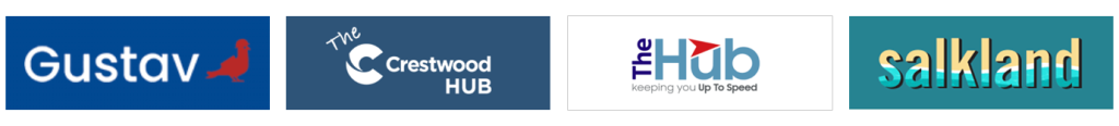
Intranet Logos
Naming your Intranet (in place of your regular brand logo) can have a hugely positive impact on user’s uptake, so we would typically recommend that you wait until a name is agreed and a logo is ready before our design process begins. If you are looking for some inspiration or advice, just ask your Designer. You have the option of using a different logo image which is also used in other areas, including Email alerts, Daily Digest emails and the Login page.
Some examples are provided below, and within our homepage examples.
What is the recommended logo size?
Our recommendation is a maximum width of 400px, and a maximum height of 150px. A rectangular shape tends to look best. The image should contain no dead space around the edges and be trimmed to the content.
Which file types are accepted for the logo?
The platform accepts PNG and JPG images. If you have an .AI, .PSD or .SVG file, these must be converted before uploading to the site and Interact can help with this.
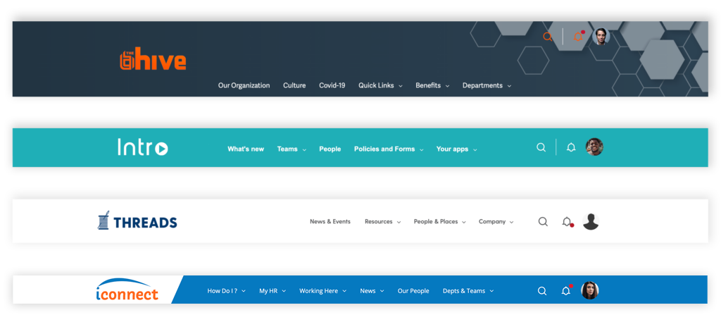
Top Navigation / Masthead
The top navigation area on your site is known as the ‘Masthead’. This is the sticky header that sits full-width across the top of the site. There are a range of ways that we can customise the visual aspects of the Masthead via the Theme:
We can change the colour and background of this area, along with the colour of the text links, icons and their respective hover states.
Clicking each Masthead navigation item brings up either the Megamenu or dropdown menu, depending on how many items you have assigned to top navigation item. which allows you to browse and select between a number of different sites, pages categories and more throughout your Intranet. This can be managed by a power user in the admin section of your Intranet.
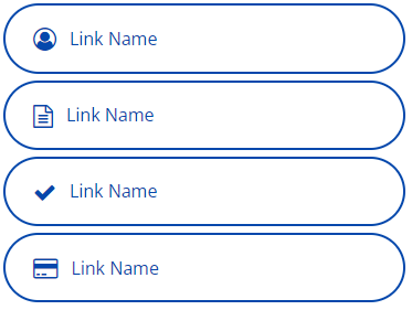
Megamenu / Dropdowns
There are two types of menu – the Megamenu, and the simple Dropdown. On both menus, we can adjust the background colour, colour of links and headings and, on the Dropdown only, add a background hover colour.
Megamenu

Simple Dropdown

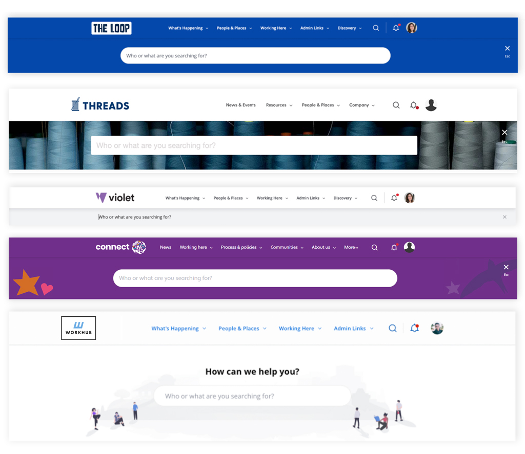
Synopsis / Search Background
The ‘Synopsis’ area, is the horizontal area that sits full-width underneath the Masthead of the site on certain pages, as well as the area behind the top search. We can change the colour of this area to give contrast to the rest of the site.
The default style for the Synopsis area displays a flat colour like the masthead above it, however it can be changed in a variety of ways. For example, we can also add a background image for you. This could be any brand asset such as a branded illustration, pattern or a photograph.
Another option for the top search, is to ‘flatten’ the search bar against the background to appear simply as a full-width strip.
This image stretches the entire width of the site/browser window, and the height of this image will depend on the specific situation. Therefore, it is not an image we can give an exact specification for, however we would go off a slightly slimmer version of the dimensions of the profile banner – 1600px width by 150px-300px height.
Profile Banner
This is the banner that appears at the top of a user Profile page, behind the avatar and is uploaded as a Theme Image.
We can use an image that is a colour (the default), gradient or any brand-related image of your choice.
We recommend a simple pattern or consistent image, so as not to distract from the content that sits on top of it.
If you do not have any brand assets you feel will work here, you could choose a stock image platform such as Unsplash.
Please note that the Profile Banner is one global image, which means that the same image will be used on all users’ Profile pages on the intranet.
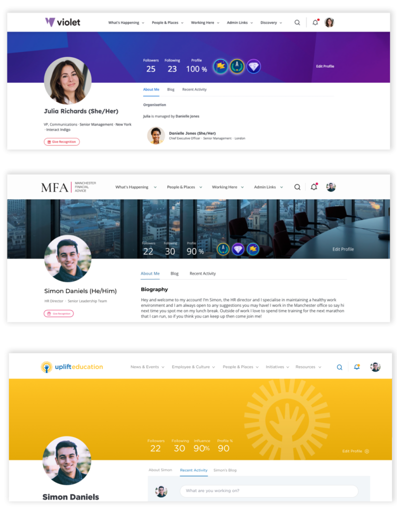
Is there a recommended image size for the Profile page banner?
Our recommendation is a 4:1 ratio size to satisfy most screen sizes – A minimum width of 1600px is advised and therefore 400px height. Your image should not exceed 2000px width by 500px height. By default, the image will expand to fit the space. Keep in mind that the image will also scale up and down with the size of a user’s browser window and device, therefore it will not display at the same dimensions in all situations.
Application Bar
The Application Panel is a feature which can sit on the left or right side of the Intranet, is sticky, and runs down the full height of the browser. The background color and text/icon color of the panel can be customised by an Interact Designer via the Theme.

We typically recommend using a dark colour, to ensure white icons and text remains readable. But this is not necessary if you don’t intend to source/style your icons to be white.
You can add, remove and change the icons at any time via the Control Panel. We do not control these icon images for you.
What is the recommended image size / file type for an Application Bar icon?
Our recommendation is a transparent PNG file with dimensions of 80px by 80px.
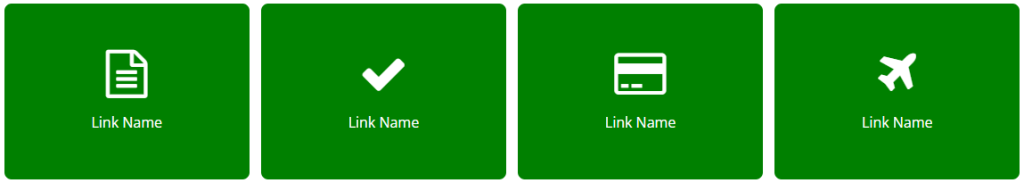
Widgets
Widgets are the boxes via which content is displayed on a homepage. Each widget serves a different purpose and the content displayed is determined by how it is configured.
As part of the Theme, we can set a universal style for all widgets to specify the title colour, title background, and typical font styles within the content (links, headings, body copy).

The homepage named ‘Widget List‘ is a homepage populated by default which displays all our content widget layouts for you to review how your theme is rendered across them all.
Buttons
Your theme’s functional buttons can be styled by an Interact Designer.
Inside the theme, we can specify the buttons’:
- Border radius
- Border width
- Border, text and background colour
- Hover colour
The font used for your buttons is the same as your body copy and link font, the text weight of your button text will also be the same as the weight of your links.
There are multiple types of buttons on your site, these include; primary, information, warning, error, and complete buttons. Each type of button can be edited separately, but we only recommend requesting changes to your primary buttons if you are unhappy with the styling used. If you would like to request changes to your buttons, it is worth considering that any buttons are intended to stand out on the screen and any colour chosen should reflect this.
Please note: this section pertains to the functional buttons in the UI. You can also add your own custom buttons into the HTML widget, such as our provided Quick Links.
Rewards
By default, the Rewards feature will use Interact’s own core blue colour on the background panel and our default rewards icon. This can be styled according to your brand palette – or it can also be a unique departure from the rest of your theme palette, should you wish to make it stand out. A simple icon can be designed by us, but if you would like to opt for something more bespoke, you can supply an image. Our size recommendation is 200px x 200px.
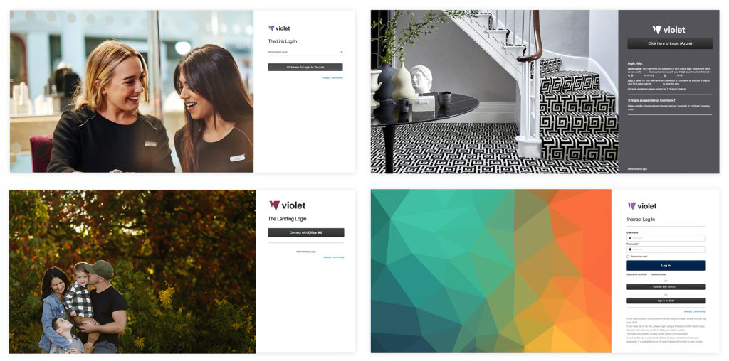
Login page
By default, your Intranet logo will automatically be displayed on the login page, above the login form – however, you now have the ability to upload a custom logo to be displayed on the login page only. Again, our recommendation is a maximum width of 400px, and a maximum height of 150px.
You are also able to upload a custom background image for your login page. The recommended format for this image is a PNG or JPEG with a 3:2 ratio – we’d suggest a minimum width of 1000px and a maximum width of 2000px. We also recommend using a pattern or simple image, as the container will adapt to different browser window / screen sizes.
Whilst there are no configuration options to add custom text on this page, if there’s something you’d like to add we will review your request.
Broadcasts
There are a few types of Broadcast that can be utilized on the intranet. The most common type is shown below, and is called a Broadcast Banner. In terms of styling, we customise the following:
- Background color and text color – we can change these to any color
- Icon – we can switch the icon to another icon from the Font Awesome 4.7 library

Mobile App
Within the Mobile App area of the Control Panel – there are fields under which you can specify the colors that you would like the Our Native App to include. It is a seperate platform to our Desktop/Responsive version – so the full range of theme items mentioned on this site will not be available with more high-level choices required instead.
Mobile options to specify:
Text & Navigation Menus – Text, Background and Accent/Buttons
Application Bar Menu – Text and Background
Login Page – Text (Title and Body) (Buttons use color specified in first section)
Images – Login Background and Application Bar Icons
For a deeper explanation of the Mobile App, you can read our article on the Community.
By default we will choose your primary and secondary ‘desktop theme’ brand colors for you.
Editor Color Palette
Our Block Editor includes a color palette for users, which can be configured to include custom colors. At the start of the Onboarding process, we will update these colors to reflect your brand palette. For guidance to change/add/remove a color yourself, see community.interact-intranet.com/page/11893.
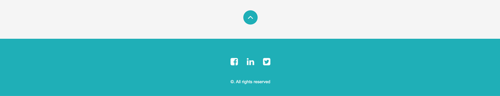
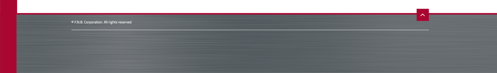
Footer
The Footer is where your social icons will appear (if you opt to use them). The breadcrumb navigation for the site will also show here by default, but it can also be placed immediately below the Masthead. The main attributes that can be changed are the footer background colour, the positioning of the information (centered or aligned to the sides), and the colour of the breadcrumbsl links, the social icons and their respective hover colours.
If included in the footer, the breadcrumb navigation will include a small logo file which could be the same or different from the logo in the Masthead, see the screenshot examples below.

Homepage Zone Backgrounds
Whilst technically not a default part of the Theme, but rather the content, adding a background to one one of your Homepage Zones is a great way to enhance the overall design, draw focus on a particular piece of content and divide up your homepage. The backgrounds on your Homepage Zones can be easily edited by either a member of the Interact Design Team, or by yourself. Regardless of who makes these changes, it is always important to check if your new Zone Background is accessible for users with difficulty reading from a screen.

How to add a Background to a Zone
If you would like to learn how to update a zone background yourself, you can do so on the Interact Community here. If you would like to add a gradient to your zone background, this can be done via an image. Alternatively this could be done by an Interact Designer via the theme or in the developer framework.
Ensure that your new background image or colour is accessible
There are a few ways to check that your new zone background is accessible, and there are multiple tools and apps that you can find online to do accessibility checks for you. Generally, you want to ensure that any text that sits directly on top of a Zone Background has a high contrast in colour. For example, a dark background would work best with very light or white text on top of it, and vice versa.
Changes to text or widget colours will require a design request.